
Available Charts
This page shows a selection of charts and overlays in FCharts Pro and SE. It doesn't list all available charts
All images have been reduced to keep the page size down
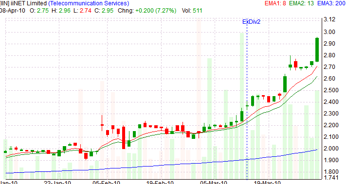
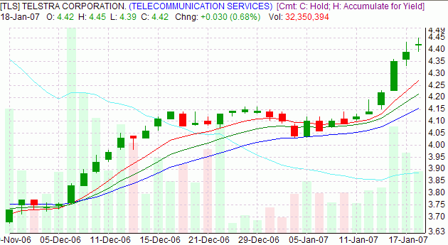
OHLC
The top chart shows a bar chart of the selected period. Along the top of the chart you can see the open, high, low and close for the most recent day, with each figure in red if they are below the previous day's close, and green if they are above. Next is the amount of change from one day's close to the next, then the volume (red for lower, green for higher) and finally the number of days currently in use to plot the Exponential moving average lines. The colours show you which line is using which number of days.
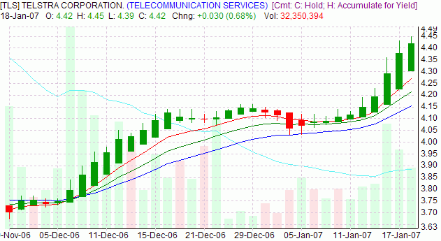
Candlesticks - The classic candlestick chart.
Heikin-Ashi Candlestick chart.
Line Chart - Shows a line representing the closing price.

Gann Swing Chart
Apart from the chart itself, you'll notice some data in the upper left corner. O is the Opening price for the last day in your database. It will be red if the open is lower than the previous day's open (Note: NOT the previous day's close!). H is the high, and again it's compared to the previous day's high. Green for same or above, red for lower. L is the low, and C is the close. Next is the Change. This refers to the change from yesterday's close to today's, not the change from today's open to today's close.
You might also see a 'Close Rqd for MA1>MA2' followed by a value. This is an extrapolation - the program is telling you what price the stock will have to close above for MA1 to cross above MA2. It will only display if MA1 is currently lower than MA2. The same applies to MA2>MA3.
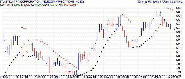
 Parabolic Stop and Reverse
A complex indicator to program, but easy enough to use. Assumes a long position is taken when +DI crosses above -DI, and then tracks the price movement. As time passes, the increment decreases, hence the 'Parabola' title. Like an artillery shell fired into the air, the momentum gradually dies off. The long position is closed when +DI falls below -DI, and a short position is then assumed. You can access the variables with SAR, InLong and InShort. See a complete description of the indicator for possible uses of these. (I provide the field piece, you have to aim it.)
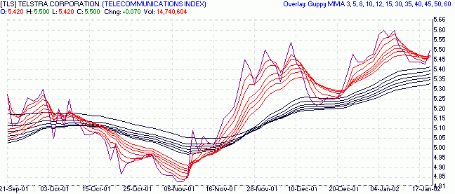
Guppy MMA
I read about this overlay in Daryl Guppy's Trading Tactics book. It consists of two separate strands of moving averages - one strand with six averages of between 3 and 15 periods, and the other strand with six averages of between 35 and 60 periods. I thoroughly recommend reading the book before using this overlay.
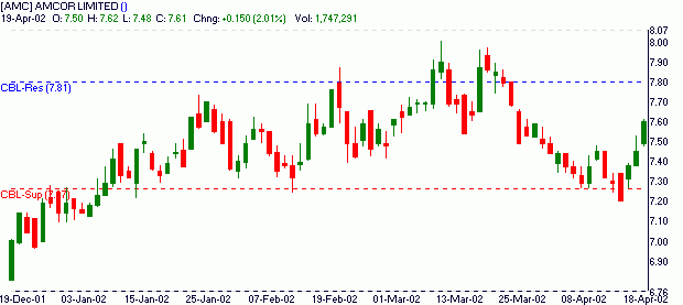
Countback Lines
Countback lines automatically pick out likely support and resistance points, based on recent highs and lows.
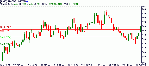
Pivot Points
Pivot lines are based on recent lows and highs.
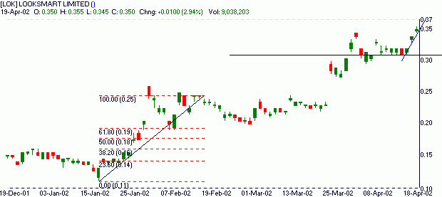
Trend Lines
If you draw trend lines on the zoomed view they will be stored on disk and displayed on both the zoomed view AND the main chart window.
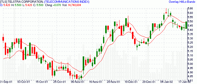
HiLo moving Average
Instead of an exponential moving average of the closing price, this overlay uses the low and high prices as its data source.
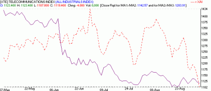
Compare with Sector
In order to use this feature you will need to have daily price values for the sector itself, and you must have allocated all companies to their sectors.
The comparison works by overlaying the two charts on the same area. Since both have completely different price axis (axes? axises?) they will both be scaled so the extreme points touch at top and bottom (like all charts). This means that it's the direction the charts are moving in that counts, rather than whether one line appears above the other. To get a decent view you can pull back to a longer timeframe.
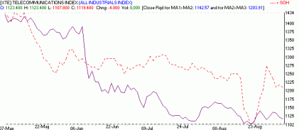
Compare with another stock
When you select this overlay you can enter any valid stock code. The second stock will be charted as a dotted red line chart over the top of the current chart. NOTE When using the new User Defined Indicators, the value of the overlaid stock can be accessed with the variable 'SecondClose'
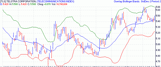
Bollinger Bands
Places bollinger bands around the current price chart. You can use BollUpper, BollMiddle and BollLower in your formulae.
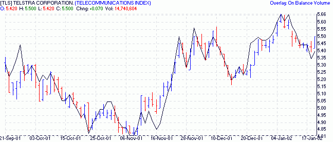
On balance volume
Displays the OBV in the same chart window.
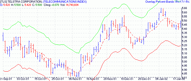
Trading Bands (Variable upper and lower percentage)
User Defined Indicators (Write your own...)
Lower window charts:
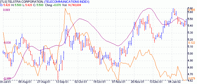
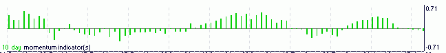
Momentum
The blue momentum bars show the difference between the current close price and the close price x days ago. (X being 10, usually, but you can change it) If the bars are above the black line the closing price is higher than it was ten (or rather, x) days ago.
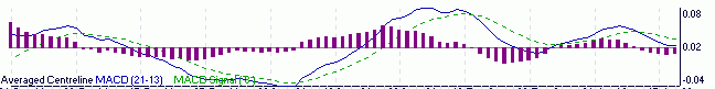
MACD
The blue line is the difference between two exponential moving averages of unequal lengths, the red dotted line is the exponential moving average of the blue line. The current number of days for each line is shown in the relative colour.
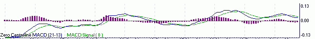
MACD (Zero Center)
As above, but drawn around a zero-based center line.
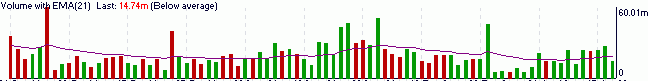
Volume
Shows historical volume, with 0 at the bottom. The red bars show the actual volume, while the purple line is an exponential moving average. By default it is 21 days, but you may change this in the settings screen.
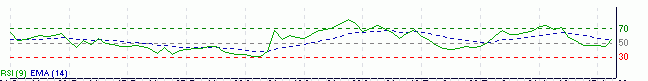
RSI
Relative Strength Index shows the RSI plus a moving average.
User Defined Indicators
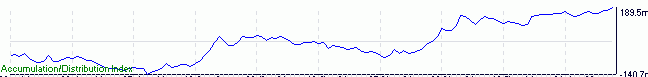
Accumulation/Distribution index
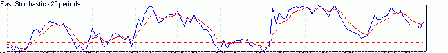
Fast Stochastics
This is a Fast Stochastic chart. You can access the values in your formulae with PercentD and PercentK keywords. EG.
close < lowest_low[30] and percentd > lowest_percentd[30]
That will tell you the price hit a 30-day low, but the percentD didn't.
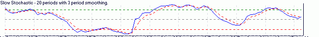
Slow Stochastics
This is a Slow Stochastic chart. You can access the values in your formulae with PercentDSlow and PercentKSlow keywords. EG.
close < lowest_low[30] and percentdSlow > lowest_percentdSlow[30]
That will tell you the price hit a 30-day low, but the percentDSlow didn't.
You can also use %K, %D, Slow%D and Slow%K instead of the full names.
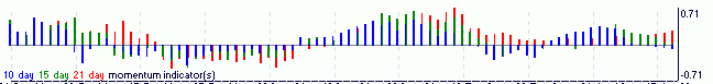
3-way momentum
Instead of using 1 range to display momentum, this chart uses three: one of 10 periods, one of 15 and one of 21. The result is a chart which displays more information about the trending of this stock. You can access momentum values 2 and 3 in your formulae with the variables MOM2 and MOM3.
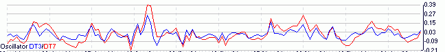
DT3/DT7 Oscillator
This is based on the close price minus a 3-period simple moving average of the close and the same again for a 7-period SMA.
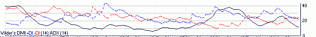
Wilder's DMI
You can plot the +DI, -DI and ADX of the current stock by selecting this chart. You can access the variables in your formula with +DI, -DI and ADX. Make sure there are no spaces between the + and the DI.
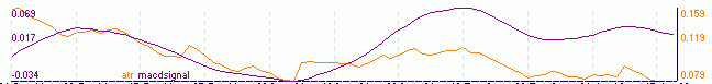
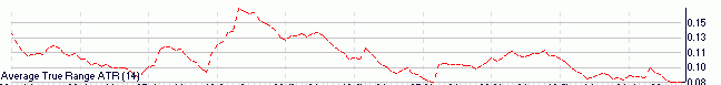
Average True Range
You can display the Average True Range in the lower chart windows. This is a measure of volatility, and the variables are ATR for the 14-day moving average and TR for the raw 'True Range'
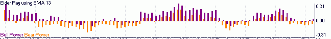
Elder Rays
As explained in Dr Alexander Elder's book, Trading for a Living
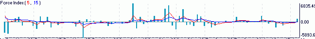
Force Index
Also explained in Dr Alexander Elder's book, Trading for a Living
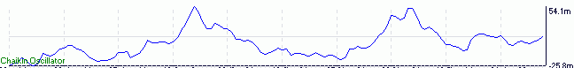
Chaikin Money Flow Oscillator
You can display the Chaikin oscillator in the lower chart windows. The variable is 'CMFO'
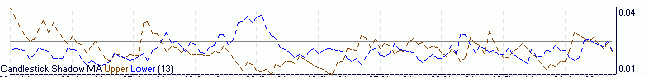
Moving Avg of Candlestick Shadows
This chart shows a moving average for the upper candlestick shadow plotted against a moving average of the lower candlestick shadow. Why? Well, if the upper shadows are mostly long and the lower shadows are mostly short this indicates that prices are rising then falling back again before the close. The Upper MA line will therefore be above the Lower MA line. If the lower shadows are longer it means the price keeps falling then recovering. The Lower MA will then be shown above the Upper MA. Some people use this indicator to determine whether a stock has bottomed.
On Balance Volume
Displays the OBV and a moving average of the OBV in the same chart window. The green line is the OBV, the solid red is the moving average and the dashed blue line is a moving average of the solid red. If the blue line is above the red, obv is trending down. If the red line is above, OBV is trending up. By messing with the periods you can make it more or less responsive to short-term moves.

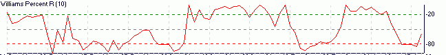
Williams Percent R
You can double-click on a chart to get a larger view in its own window. While zoomed in you can select a drawing colour from the pallette and cover the chart with support and resistance lines, trend lines or anything else. Click and hold the mouse, then drag to a new point before letting go. You can move whole lines around by dragging them with the mouse, and you can move end-points the same way. As the mouse passes over a line you have drawn, the cursor changes to a cross with arrows or a diagonal line with arrows - when it's a cross with arrows, hold the left button to drag the current line around. When it's a diagonal line with arrows you can hold the left button to drag the end of the line around.
In the Zoomed view you can also drag the chart to the right and left when the time-frame is six months or more. To do this, just click and hold the right mouse button on the chart window and move the mouse. When you release the mouse, the chart will stop in its new position.
If you change the time-frame using the buttons at the top of the form, it will also change the time-frame in the underlying main chart.

All my software is virus-free. No unwanted toolbars, trojans or other nasties.

• yWriter for MacOS is in progress!
• iOS and MacOS update
• yWriter Android released
• Android Update
More ...
My free software includes
FCharts 2
RMP3
TrackAMinute2
yCopy2
yEdit2
yPlay2
yRead3
yTimer2
yWriter7
yWriter Mac
Site built with
yGen2
by Spacejock Software
